
To begin with, as an artist myself, I have always felt that colour theory is a curse and something that is unreachable, incapable of learning easily and quickly, whereas I’m gradually learning a piece of information about it every single day as much as possible. It is hard to believe of how much progress I have made after learning even a little bit of colour theory, where i had seen a development in my art recently. So now, here I am to share my information of colour theory.
What Is Colour Theory?
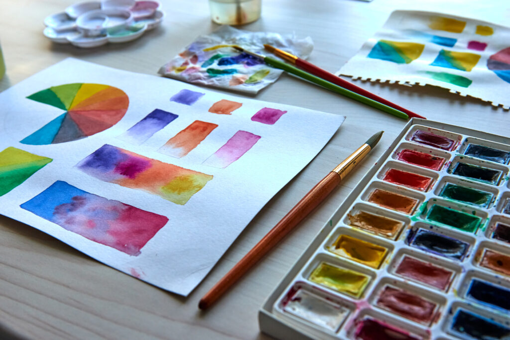
Colour theory, in general, is a set of principles used to understand how colours interact and match or oppose each other, how they are created, and how they affect emotions and perceptions. Artists, designers and creators use these concepts to make colours look harmonious and mostly balanced.
The Colour Wheel
At the center of the colour theory, we have the colour wheel, composed of 3 sections which are:
The Primary Colours
- Red
- Blue
- Yellow
These three colours are the base colours. They are called the primary colours because their true colour pigments cannot be created by mixing any other combination of colours and all other colours in the colour wheel are derived from these three hues, When added together, they create a pure white light.
The Secondary Colours
On the colour wheel, they are located between primary colours. These colours are combinations created by the equal mixture of two primary colours. For example:
- Purple = Red + Blue
- Orange = Red + Yellow
- Green = Blue + Yellow
The Tertiary Colours
There are six tertiary colours in total. These colours are made by combininy a primary and a secondary colour.
- Blue – Green
- Red – Purple
- Yellow – Green
The colour wheel helps us build colour schemes that feel right.
Colour Harmonies: How Do We Choose Colours That Match Each Other?
1. Complementary Colours
These colours are the ones that seem to be opposites on the wheel. They bring out the best in each other by making their complement more vibrant and noticeable, creating a strong contrast. We can give Blue and Orange as an example for this subtitle.
2. Analogous Colours
Analogous colours are groups of colours that are next to each other on the colour wheel. The term analogous refers to having analogy or corresponding to something in particular. They appear to have soft and relaxing combinations, which are great for calm and natural looks. For example, Yellow and Green can be count as analogous colours.
3. Triadic Colours
A triadic colour scheme combines three colours evenly spaced around the colour wheel, typically a dominant colour plus two supporting colours. They give off a bright, energetic, and balanced look. Orange, Purple, and Green are triadic colours.
4. Monochromatic Colours
Monochromatic means a colour scheme that is composed of a single colour or hue. The other colours within the colour scheme are all light and dark variations of that hue. They usually seem visually unified, minimalistic and clean. Light blue or Navy blue can be given as an example for monochromatic colours.
Warm Vs. Cool Colours
On the other hand, we have warm and cool colours which can play with human emotions pretty easily, changing the whole mood and tone when switched between each other.
Warm Colours – Red, Orange, Yellow
Colours that create an exciting, energetic environment which is great for grabbing attention to it plus creating warmth. Researches suggest that warm colours can lead to metabolical changes like increased blood pressure, or even our behaviour and decision-making processes.
Cool Colours – Blue, Green, Purple
Colours that feel soothing and peaceful, which is perfect for creating a relaxed mood. Like warm colours, cool colours may have a calming effect on the body and enable us to focus better on our work or other important things.
Why Does Colour Theory Matter?
It is normal to feel bothered when you see an awful colour scheme and amazed when seeing a balanced composition. You don’t really have to be a professional to understand the concept of colour theory, although it can help you be more productive in your daily life, like when you are choosing your outfit or designing your room or workspace. It is a simple tool that anyone can learn with basic understanding of the colour wheel, and the emotional impact of colours, so you can allow your creative ideas to transform into confidencial projects.